A few years ago, I was cleaning out my mother’s tool shed, which had few…
Great product with great design = a great new brand!
 One of the most satisfying aspects of our work is helping our clients grow and succeed – even after our design work is complete. Especially when we work with a client in startup mode, we want to make connections and give introductions and cheerlead long after the work is finished.
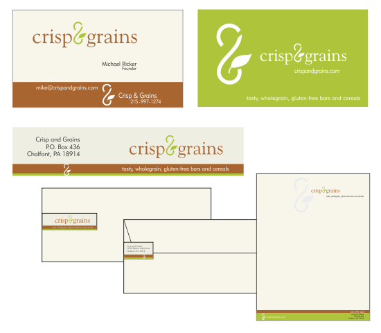
Which brings me to a new company and partner we’d like to introduce: Crisp&Grains.
Crisp&Grains (crispandgrains.com) provides the gluten free community with great tasting, convenient, wholesome foods. And it’s not only for people with gluten issues, it’s for people looking for healthy alternatives to typical snack foods. And yes, we’ve tasted them. Hence the crumbs on my shirt.
A few key pieces from our Brand Positioning Statement and Design Brief.
Target Audience:
Primarily people who suffer from gluten allergies who need to avoid certain grains to maintain a healthy diet. C&G provides a simple yet wholesome food to enhance the gluten free lifestyle. Other groups are people who are looking for healthy alternatives to typical (less healthy) snack foods. C&G tastes good, low in sugar, no fat, and has no dairy. This is attractive to both groups.
Perception/Tone:
A modern, current company founded on going back to basics. Use contemporary design aesthetics and convey simple wholesome & healthy. Recall a time when you could read and understand the ingredients in a product.
Competitive positioning:
We are the only whole grain gluten free bar on the market providing sustainable nutrition without all of the sugars and processed starches found in other bars. A health food product for people with gluten allergies who want choice without sacrificing taste and health. In a word, inclusion.
Brand promise:
Wholesome gluten free snacks that taste good and can be enjoyed by all. Very modern ampersand symbol that within it, a stylized “C” and “G” for Crisp and Grains. Symbol hints at an infinity loop representing wholeness and sustainability. Font is classic Goudy tying it back to a more traditional time. A very clean and simple design.


